Fade-in using only CSS
Needing to display a message to users unable to run JavaScript, I had to look at pure CSS solutions for fading elements in and out.
When a project is a bit jQuery heavy, I like to at least notify those poor few who aren’t able to run JavaScript, so that they know why they might be getting a sub-par experience. It’s a habit that was formed through a few years of working with NHS and banking organisations, where people were still using older browsers and operating systems.
Obviously the ideal is that a website would work for everyone, but on a particularly creative ‘showcase’ type site this isn’t always possible. Sometimes that level of interactivity is what makes the site.
Generally I add an out-of-the-way notification – a little bar at the top or bottom – which I remove with jQuery if JavaScript is enabled in the browser. This week though, the notification I was adding was full screen, essentially obscuring the website if JavaScript was disabled.
Removing this with jQuery on document ready meant that it would briefly flash up before being removed, even on modern browsers.
Self-invoking animation
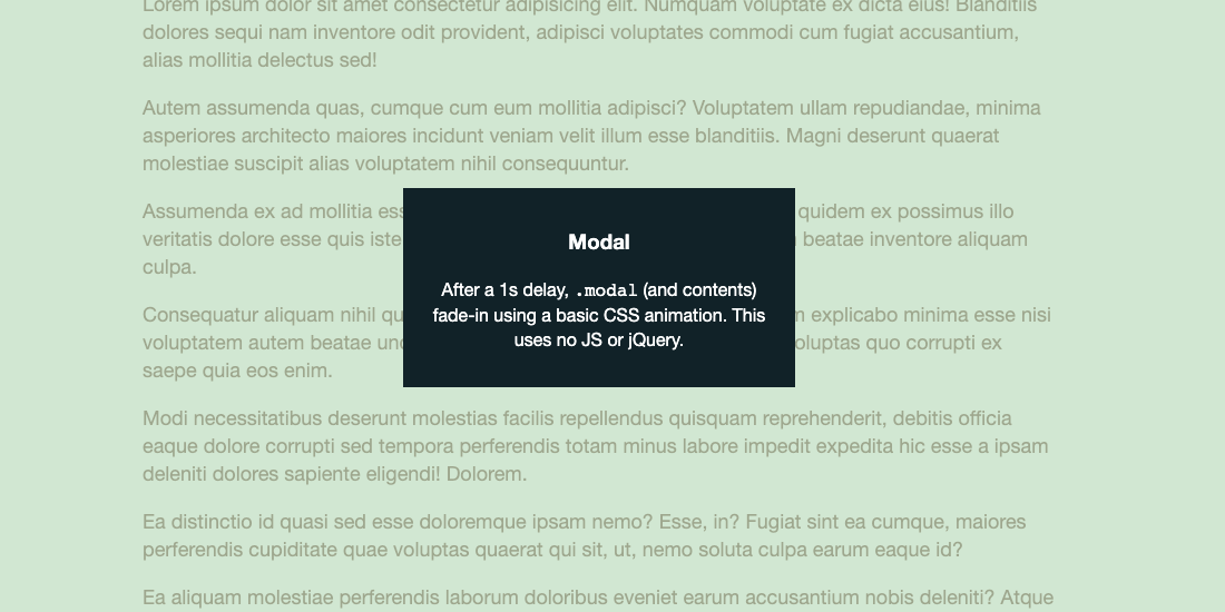
I started to look at pure CSS solutions in addition to removing the element with jQuery. The idea was that the notification would be invisible after would fade-in after a second or two if it hadn’t been removed form the DOM.
CSS animations
A nifty solution is possible courtesy of CSS animations, and an animation delay.
The notification (modal, bar, whatever you want) is set to opacity: 0 to avoid that flash before jQuery removes it from the DOM. An animation is set to bring it up to opacity: 1, with a delay of a second or so.
I’ve created a demo on CodePen, where you can see the full code and how it works.
// Modal animation
@keyframes fadein {
    from { opacity: 0; }
    to { opacity: 1; }
}

// Modal styling
.modal-wrap {
  background: rgba(0, 0, 0, 0.75);
  color: white;
  display: flex; // Allows us to centre the child element
  position: fixed;
  opacity: 0; // Initially not visible
  top: 0;
  left: 0;
  height: 100%;
  width: 100%;
  z-index: 3;

  // Animation trigger
  animation: fadein 1s;
  animation-delay: 1s;
  animation-fill-mode: forwards;
}
.modal-inner {
  background: #000;
  border: 1px dashed #fff;
  margin: auto; // Centres the element vertically & horizontally due
  max-width: 320px;
  text-align: center;
}